I worked full-time at Questrade as the UX & Graphic Design Team Lead from 2008-2012. The major project I worked on was Questrade's trading platform. They wanted to replace their third-party apps with a modern, user-friendly in-house solution that would reduce cost and be an excellent product for their customers.
I was fortunate enough to join the Questrade team on the ground floor during the platform’s inception. The team initially consisted of myself, and grew to ten people over four years until the platform launched.

Since Questrade customers were using an existing system, we had access to valuable data and feedback as our starting point. Our discovery phase involved gathering as much information as possible including pain points, liked features, and requests from our customers. We conducted in-depth interviews with our users, SMEs, and customer service reps to understand more about our customers and any issues with our existing platform and processes.

The desktop platform would be aimed at our active traders, the web would accommodate our novice and long-term investors, and the mobile app would be used by all three for trading on the go.

The platform wireframes were extensive and went through numerous iterations. Our biggest challenge was ensuring that novice traders could successfully use the web and mobile apps. Our simplified solution included intuitive site architecture, a basic layout with minimal customizations, and reducing features that only advanced active traders would use. We also created a community website where users could get help from forums, read online help documentation, and watch video tutorials.

Desktop Platform Wireframes Sample


Desktop Platform Final Design

Web Axure Prototype

Web Final Design

Mobile Axure Prototype

Mobile Final Design

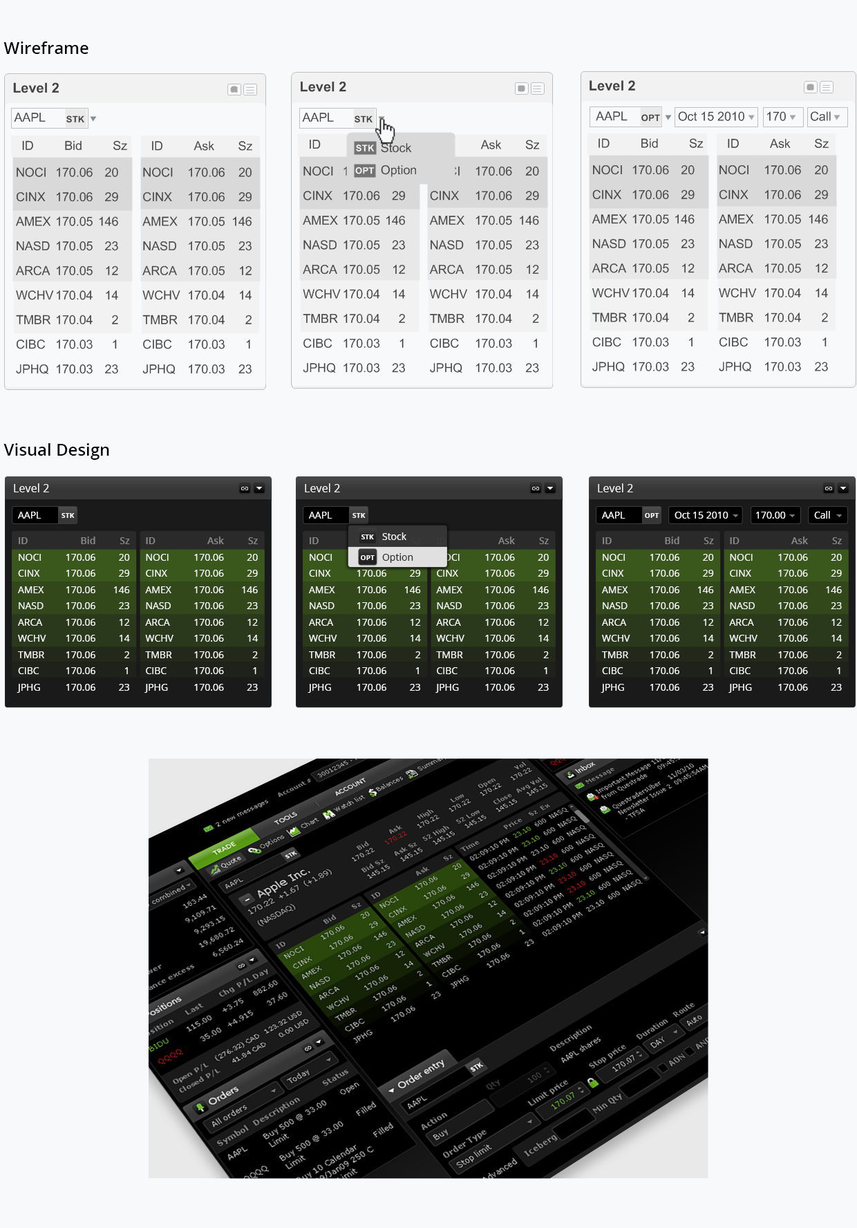
Another example of a hard problem we faced when designing the platform was the symbology format change.
Problem
Option symbology changed significantly in 2010 in the US and Canada from a five character-ticker format to 21 characters. While the new symbology was a vast improvement over the old cryptic one, it still took a long time for traders to read and type the new symbols. Previously within Questrade’s trading platforms, stocks and options could be entered into one symbol lookup field, but after the symbology change, we needed to come up with a solution that would be easy to use and understand for our traders.

Solution
I recommended we adopt a consistent, user-friendly format, rather than a long 21 character ticker, so traders could easily identify and enter symbols throughout the platform. Within the user interface, I designed a stock and option switch to simplify the idea and allow traders to easily change the expiration, strike, and call/put type without the need to type a long ticker which could introduce errors. We tested the new feature with a group of traders, which was very successful. They antipated how it would work and did not have any issues using the switch and entering new option symbols.

Throughout the entire design process we had many user testing sessions where we gathered valuable feedback. We tested using the old platform at the beginning of the project, Axure prototypes during the design phase, and the new platform with our internal, alpha, and beta test groups. This allowed us to focus on resolving issues by making continuous iterations and retesting along the way.

We sent out a survey to our beta testing team before the official launch and we were pleased with the results.


